Day 1 - 30 MARCH 2026
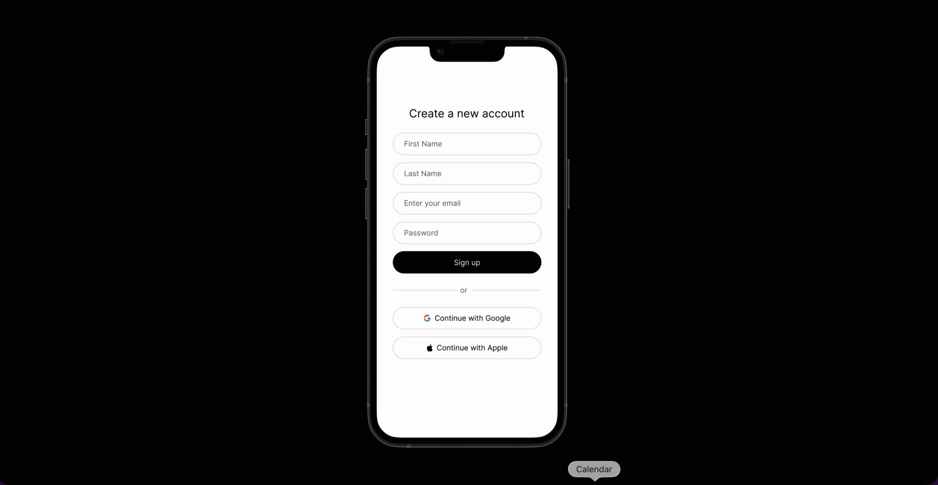
Signup Page


A minimal sign-up surface with name fields, email, password, primary action, and social sign-in. I built this as the first Daily UI challenge.


Design Iteration
The challenge sounded simple at first, but it was harder than expected. I started with a very naive version: stacked fields, no social sign-in, and tighter 8px corner radii that felt too sharp.
After reviewing established flows (Claude, ChatGPT, examples on Mobbin), a few patterns stood out:
- Rounded corners: Most interfaces use 16-24px radii with very thin borders, then increase emphasis only in focused states.
- Grouping: Related data can be grouped, such as first name and last name on the same row.
- Email-first: Many flows reduce perceived effort by leading with email and progressive steps.
- Social sign-in: A social option is common and helps reduce friction for onboarding.
Why Rounded Corners?
According to Chuquichambi, Erick G., et al. (2022), contour (or the outer lines that define the shape of an object) can determine whether an object is pleasing or displeasing from the human perspective. People perceive curvilinear form as more pleasant than angular forms. This makes sense because given human evolution, we often associate hard and sharp things like knifes, or weapons as something threatening.
Prototype
I created the signup page prototype on Iphone 13 frame and got to practice creating components and their variants. For example, a button has 3 states: default, hover, and loading. Input fields have 2 states: default and focused. Instead of repeating myself, I could create a component with those variants and create instances everywhere else.
Reflection
- Planning is VERY important. Of course, you should not be stuck in planning for too long without execution but sketching the flow or the interface on a piece of paper before opening Figma can be beneficial. I jumped into Figma way too soon and there were things I only realized along the way, especially during the prototyping process. I realized there's actualy a lot going on with just a "simple" signup/sign in flow. For example, there should be a success state when the user successfully signs up, the failure state when they fill out information that does not meet the requirements, or the loading state. By the time I noticed this, my Figma was too messy and it was a pain to reorganize stuff and figure out what's to go next from the current state.
If I were to do it again, this is the flow I would follow:
- Question: Apart from authentication, what does it mean to have a great signup user experience? This is important because this is the only friction the users must experience before being able to explore the product features. I myself dropped the signups so many times because the flow was too lengthy and complicated.
- The user experience and interface is determined by the framing of the problem. Am I trying to solve the problem of users not finishing the signup phase, hence not even using/pay for the product? Or am I trying to create a seamless signup experience only?
- Pen & Paper: Before opening Figma, I will brainstorm my thoughts on paper and try to think about the flow from end to end (start to successful or failed signup). Oftentimes, the flow and interactivity is more time-consuming to plan than the interface design itself.