Day 2 - 31 MARCH 2026
Credit Card Checkout
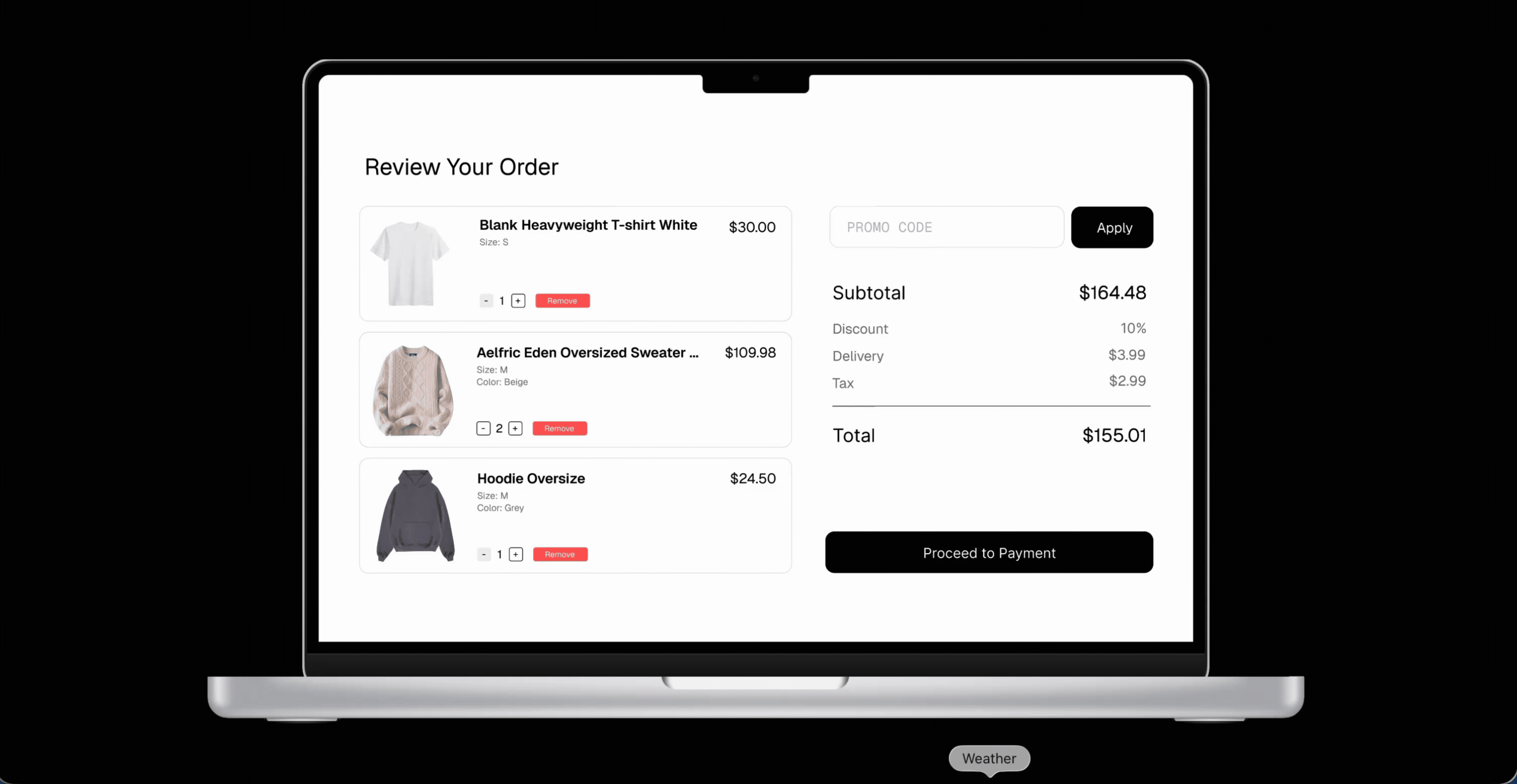
A review-your-order screen with cart line items, promo code, totals, and a clear path to payment — Daily UI checkout exploration.
Overview
This challenge focuses on the moment before payment: reviewing what is in the cart, understanding discounts and fees, and feeling confident to continue. The layout pairs a scannable list of products on the left with a compact order summary and primary action on the right.
Design decisions
High-contrast typography for the page title and total keeps hierarchy obvious. Line items use a card pattern so quantity and remove actions stay aligned without crowding the product copy. The promo field and apply control sit above the breakdown so users see savings before tax and delivery.
Reflection
Checkout is rarely “one screen” in the real world — error states, empty carts, and payment method selection all deserve the same clarity. This mockup is a baseline for that story.